Kunsthalle Mannheim
Visitor Orientation System
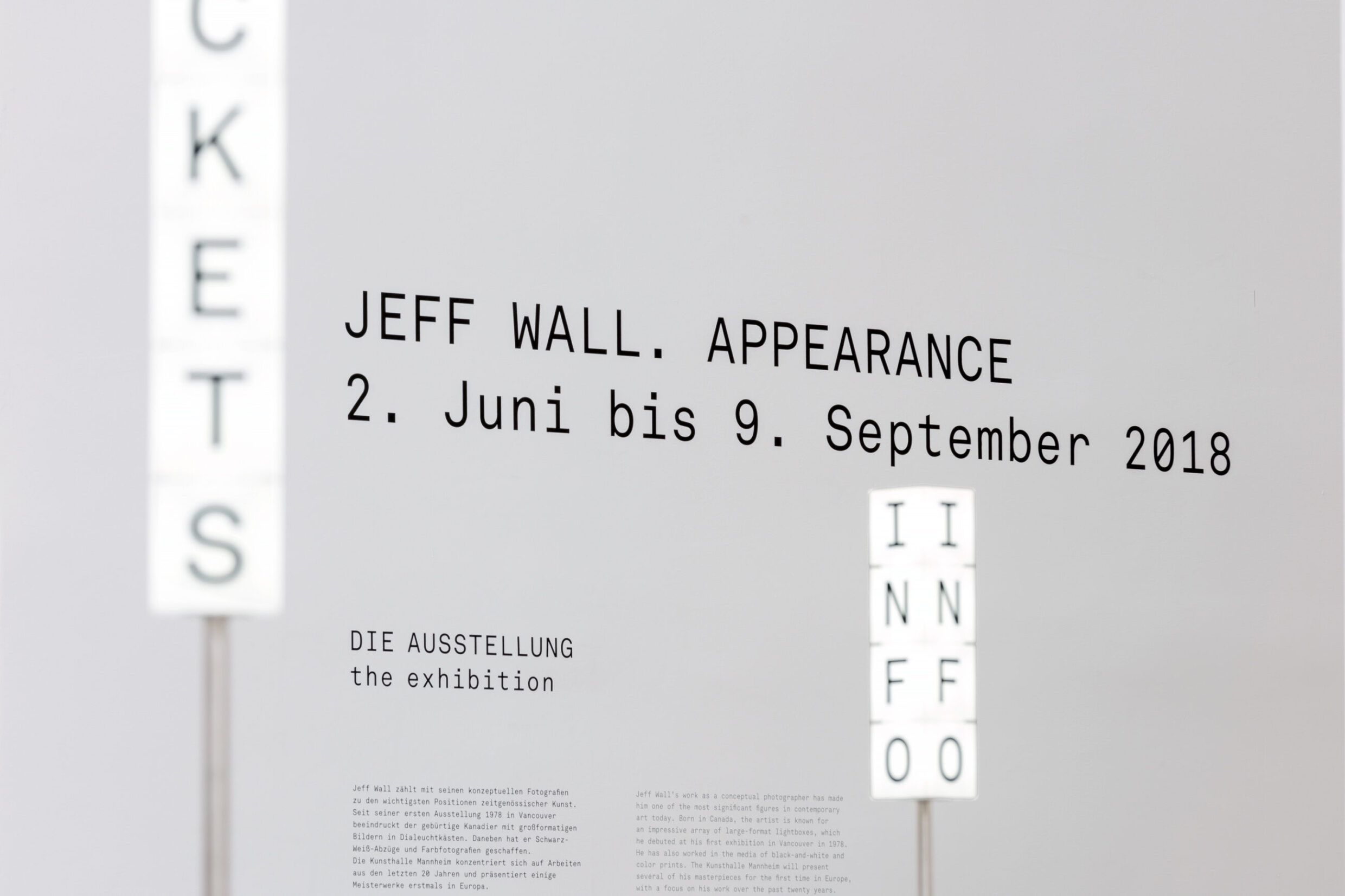
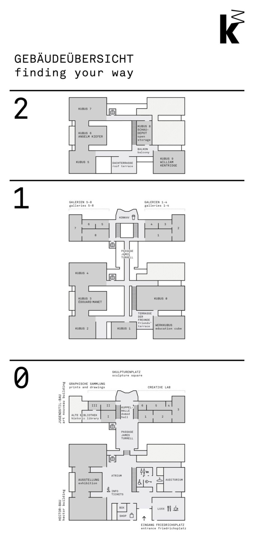
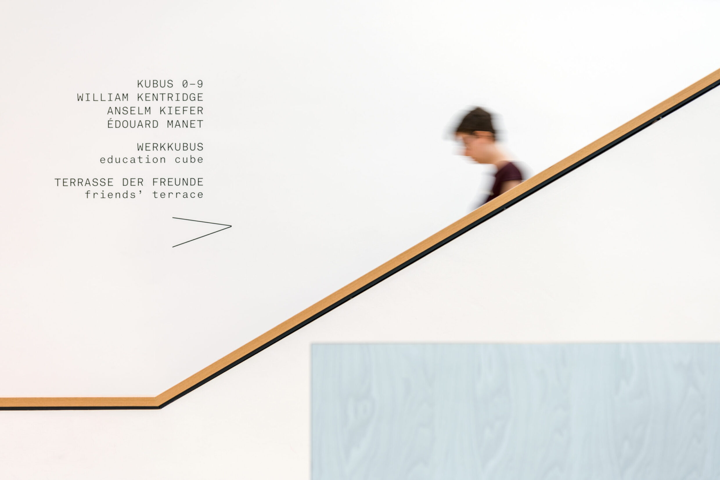
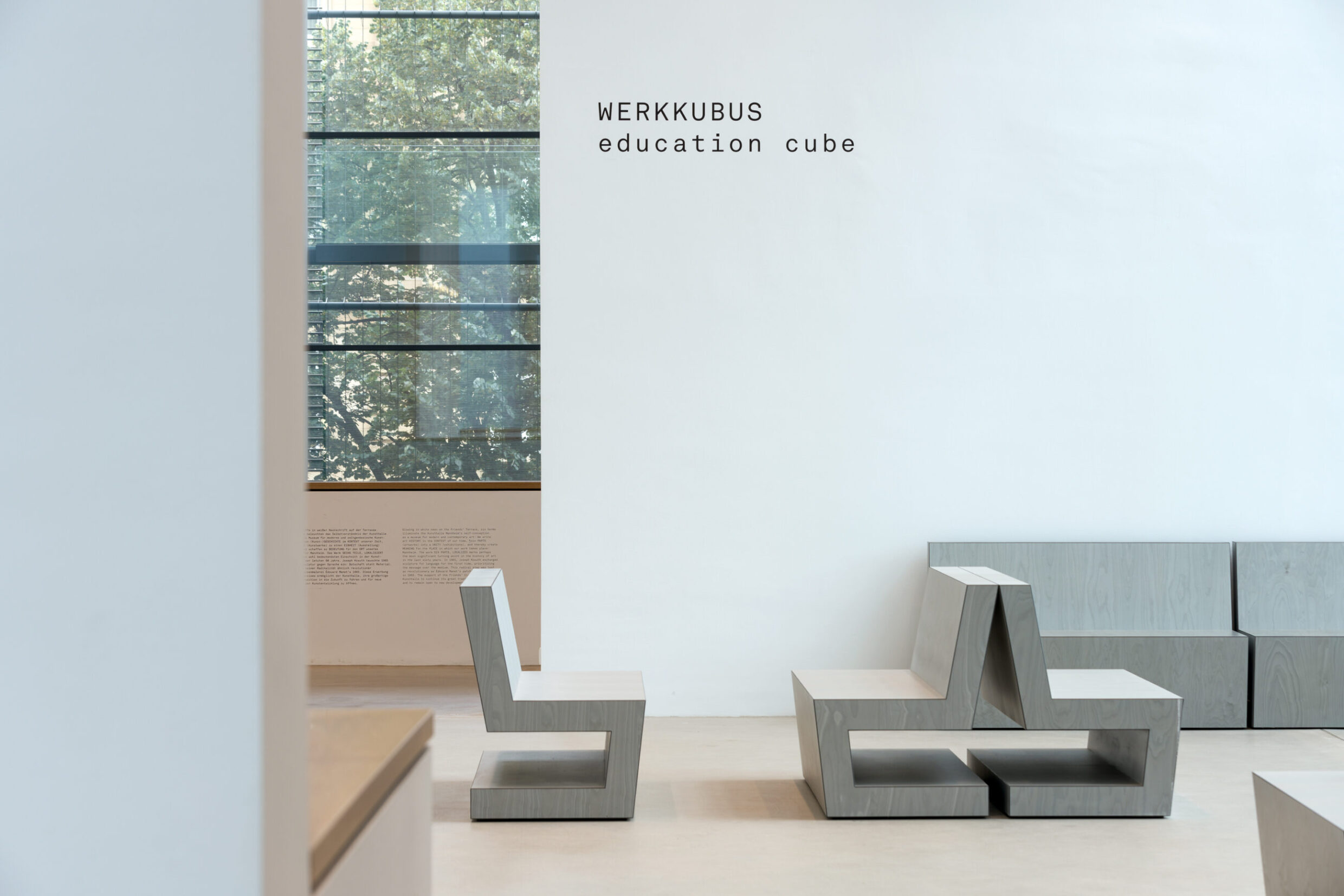
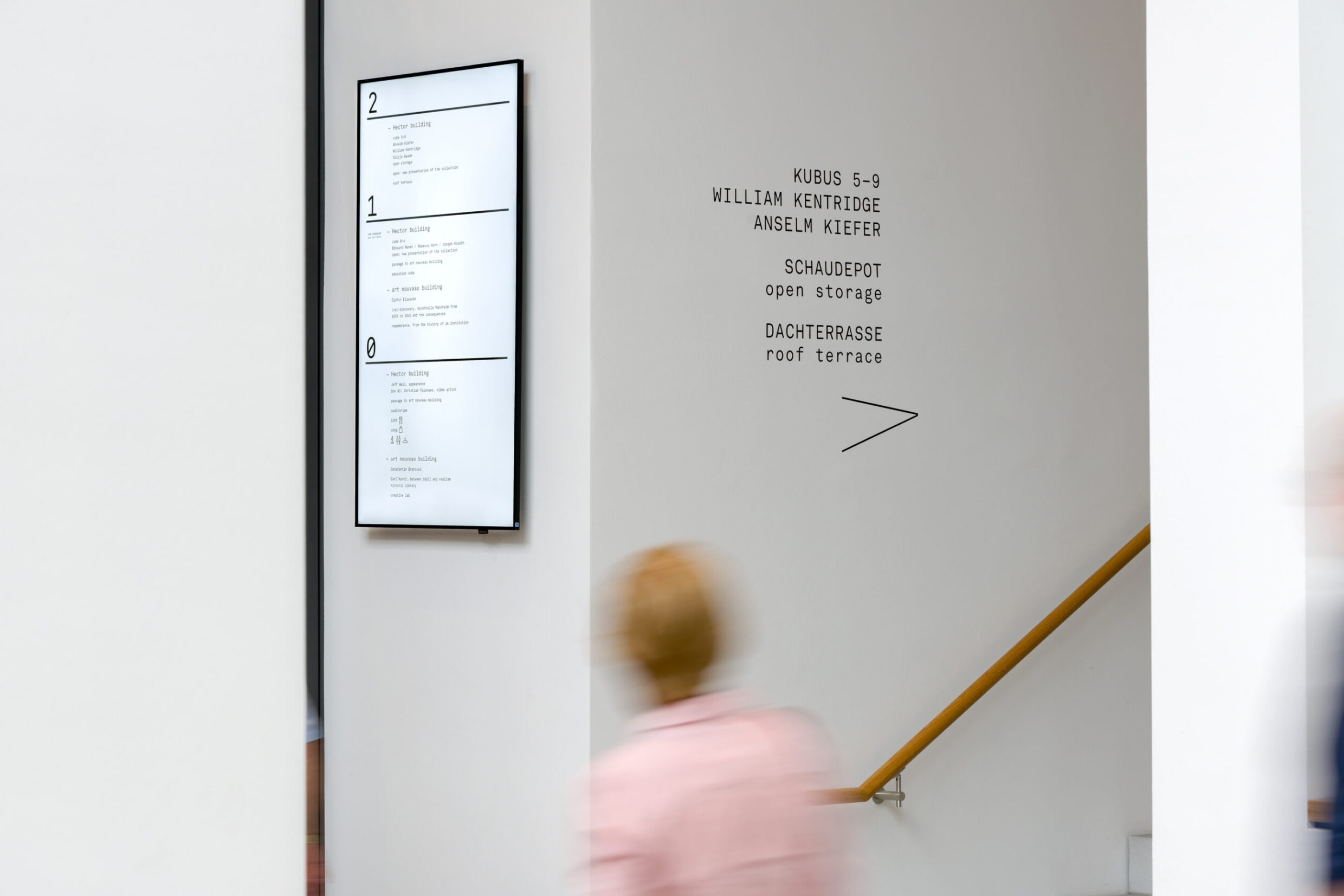
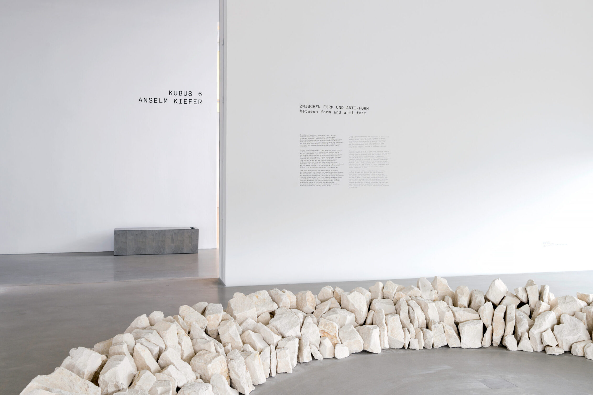
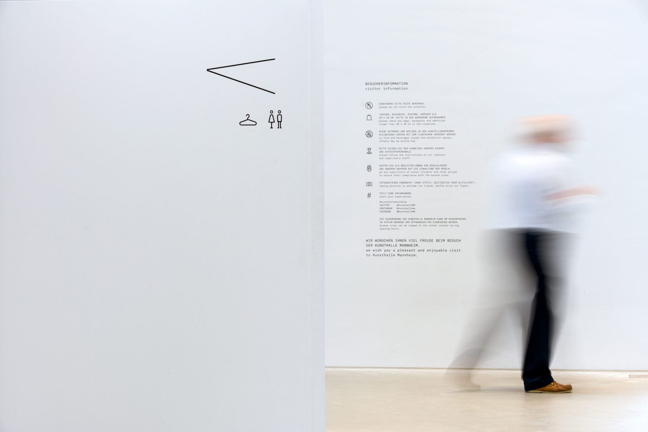
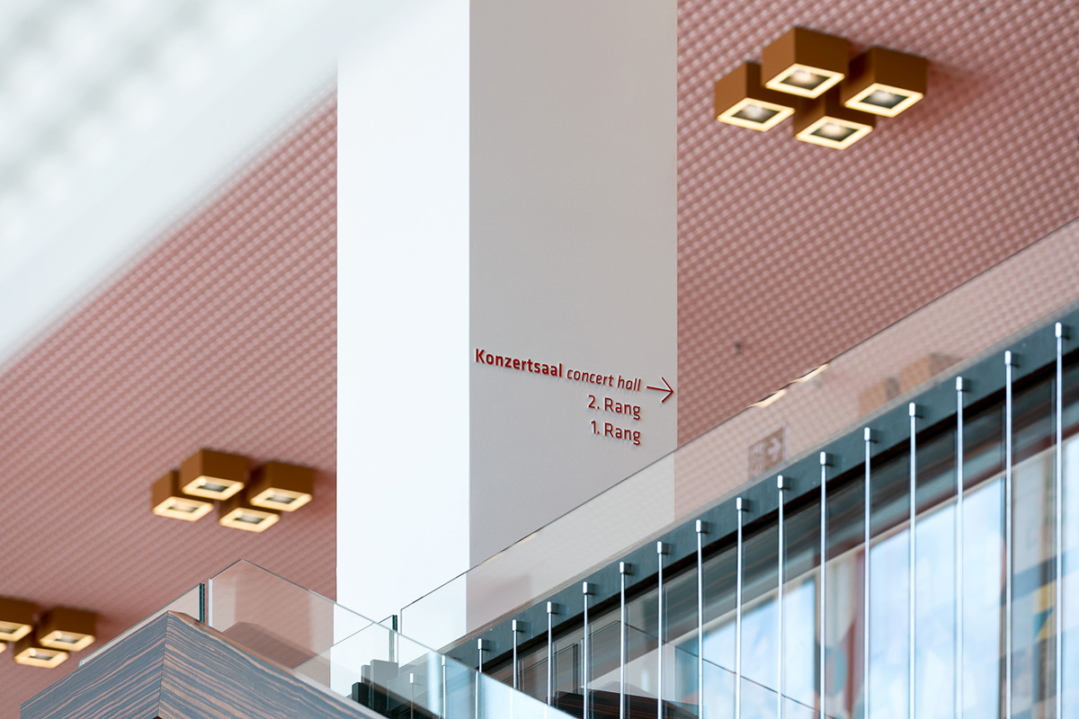
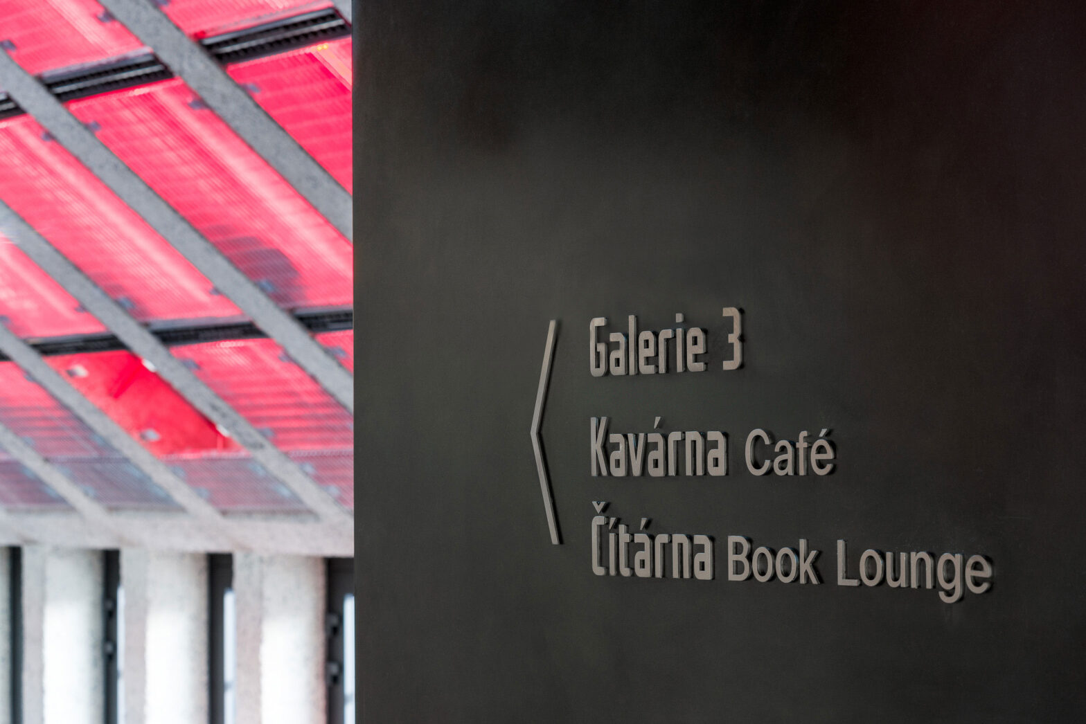
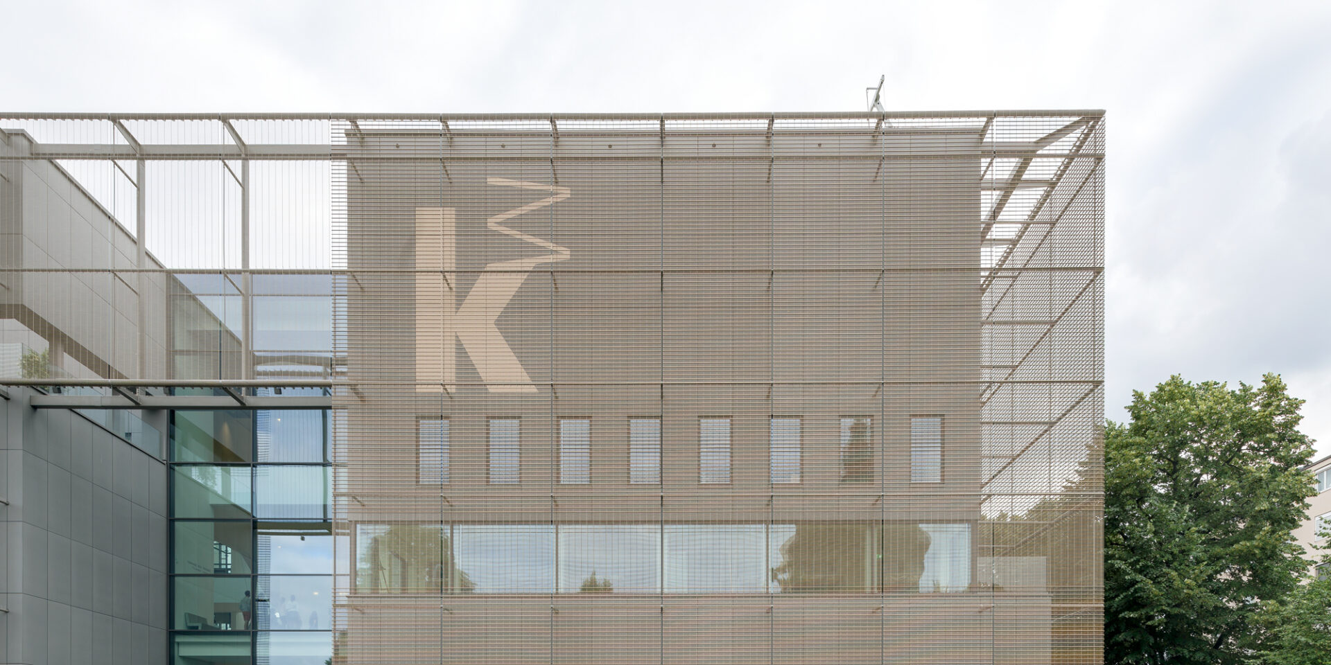
Mannheim now has a new art hall. With the new building, gmp, von Gerkan, Marg and Partners Architects realised the architectural idea of a “city within a city”. In analogy to the space-forming elements of the city – house and block, street and square – varied tours through closed and open spaces with alternating views are created for the visitors. Moniteurs was commissioned for the analogue and digital visitor guidance system and for the initial graphic equipment of the exhibitions in cooperation with Axel Kufus / OH Studio, responsible for interior design. In terms of design, the orientation system fits into the architecture of the Kunsthalle, thereby significantly supporting the identity of the building and carrying it naturally into the very last corner of the building.
Visitor Orientation System
Mannheim 2017/18
Client
Stiftung Kunsthalle Mannheim
Area
17,366 sqm
Photos
Stefan Schilling
Award
European Design Awards 2019, gold


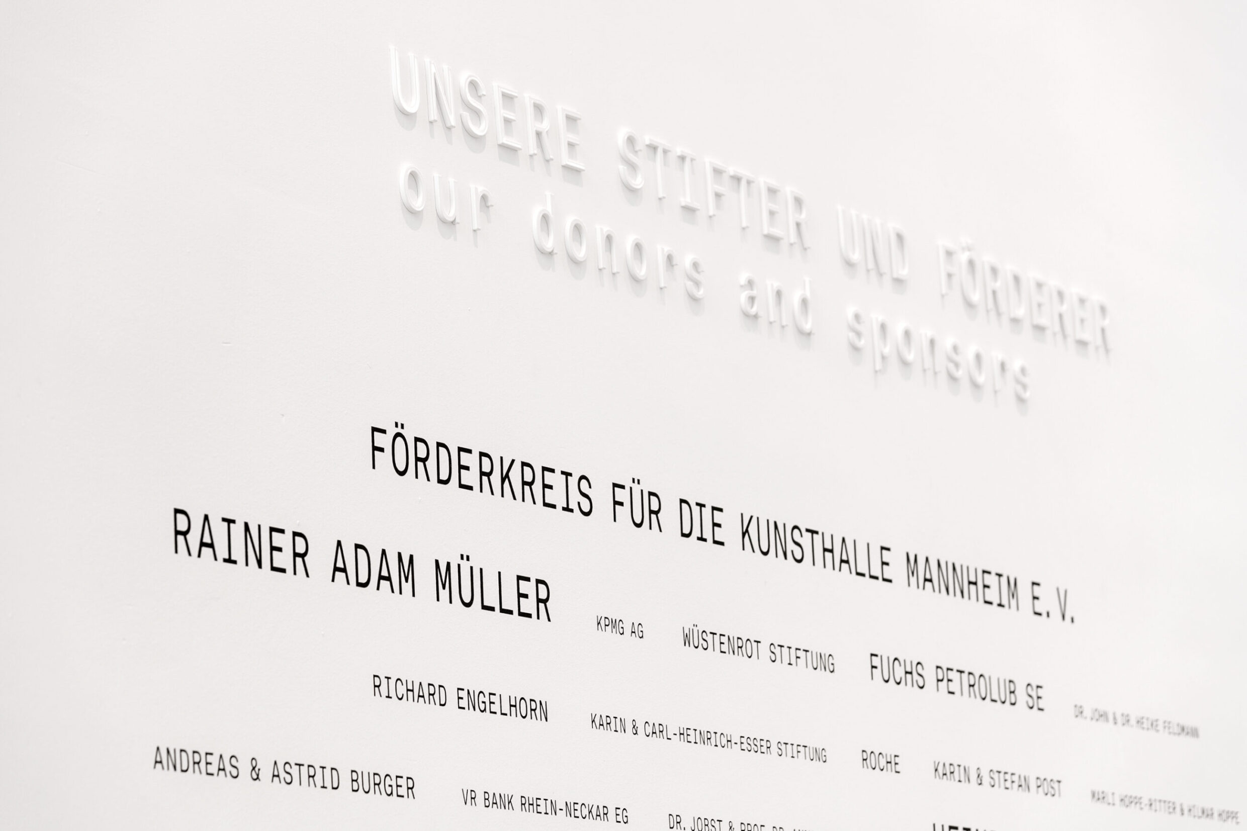
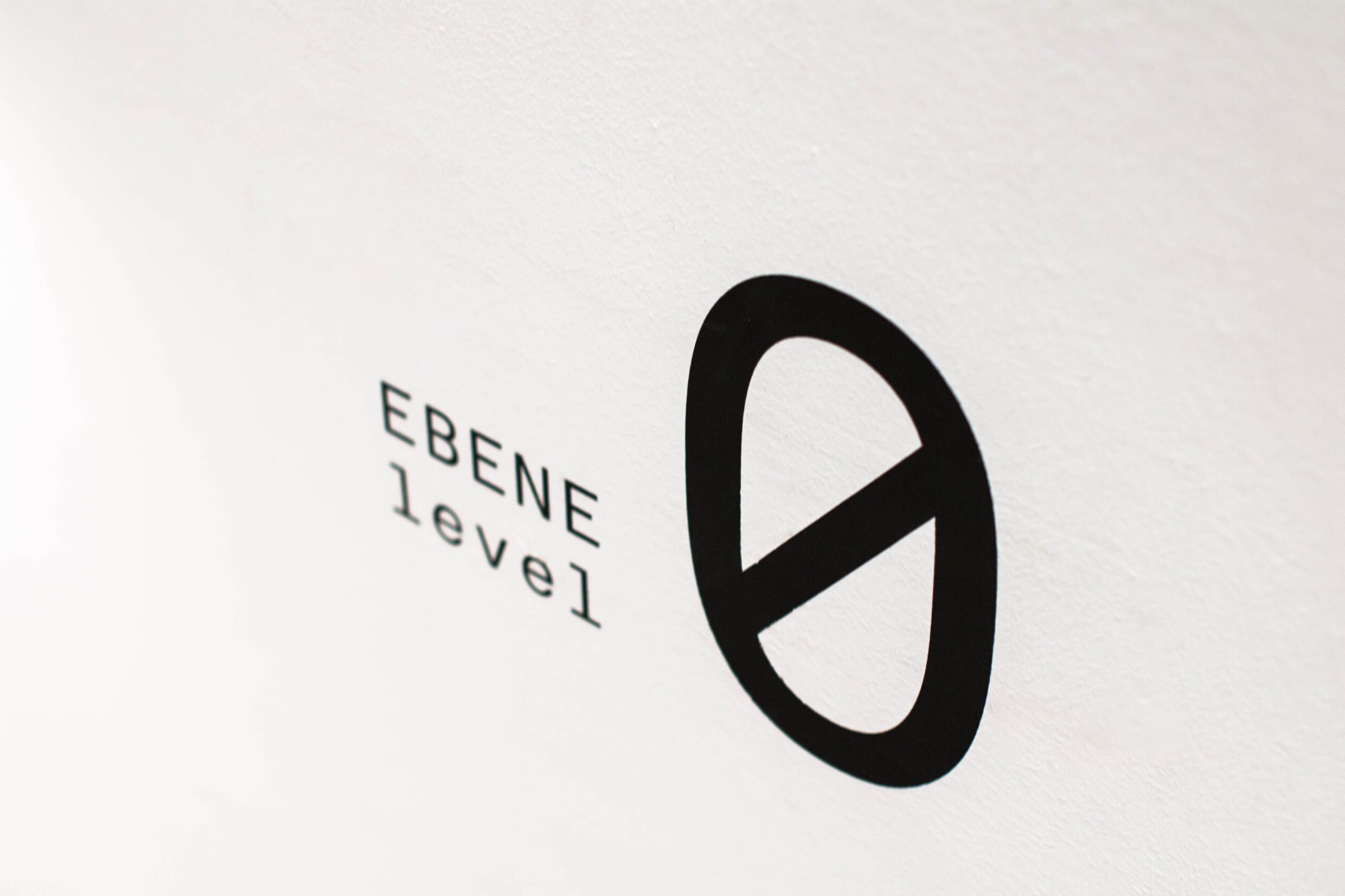
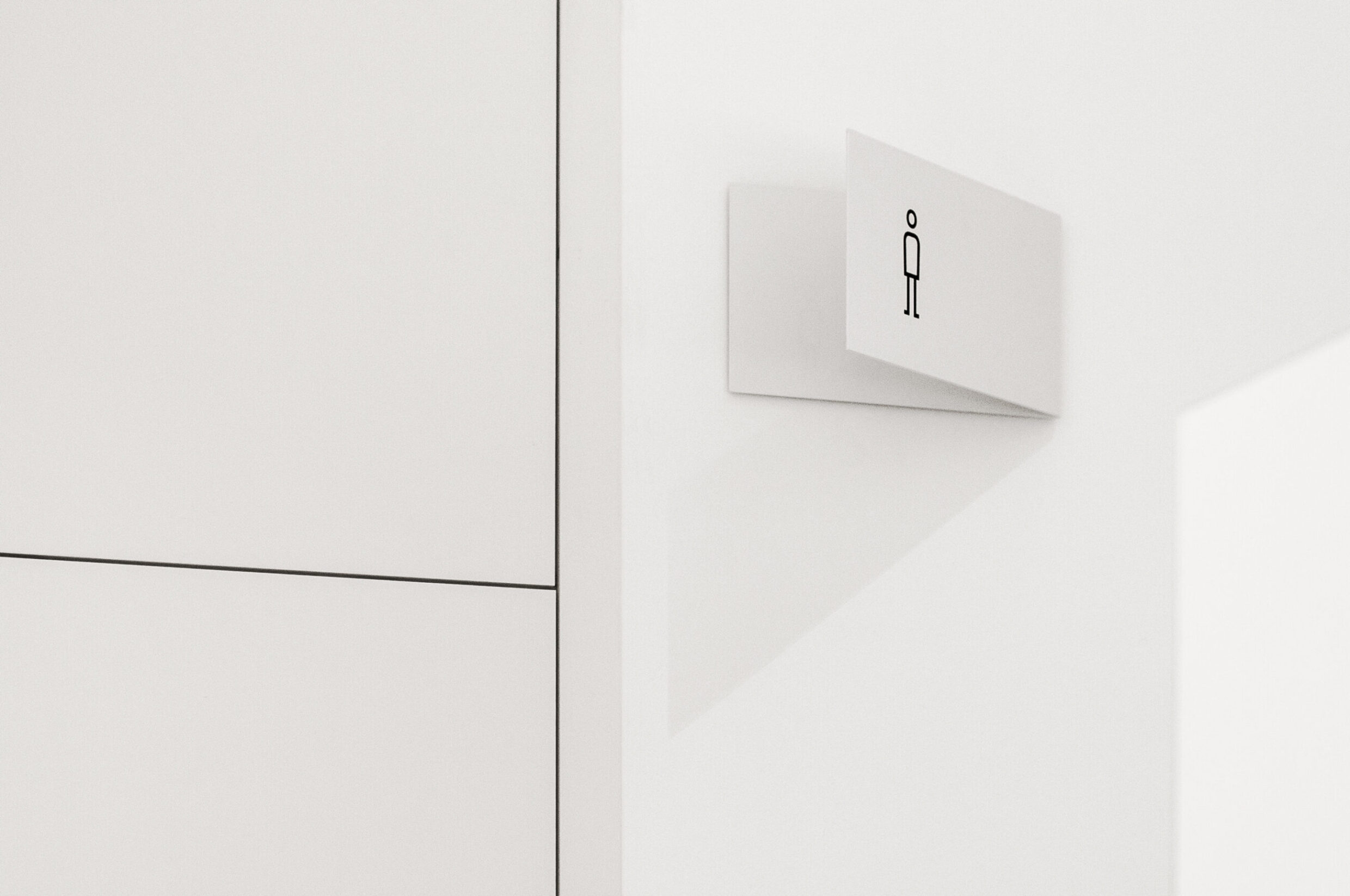
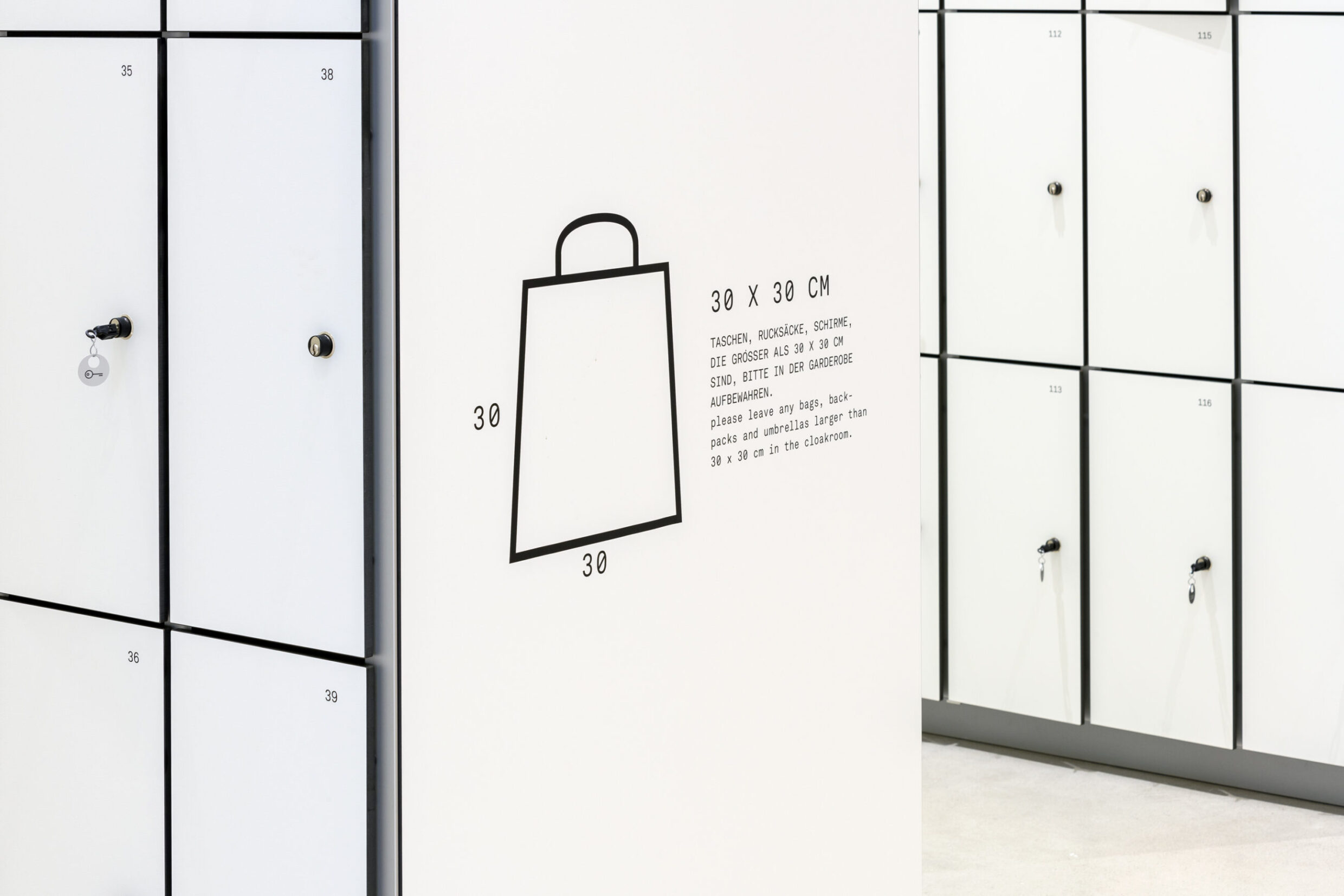
Based on the architecture, we have developed several decisive design features: big but not too big; easy to read; directly on the wall, not on a support; framed – pure, clear, direct. The architectural grid is adapted to a unit suitable for the wayfinding system and serves as the basis for arrangement and order. This imaginary grid holds the graphic information steady. It can also be found again on the facade in the mesh, a transparent metallic texture. The mesh that characterises the entire building is the first thing the visitor sees from the museum, and from there we take the mesh into the museum.
