E-Werk
Orientation System
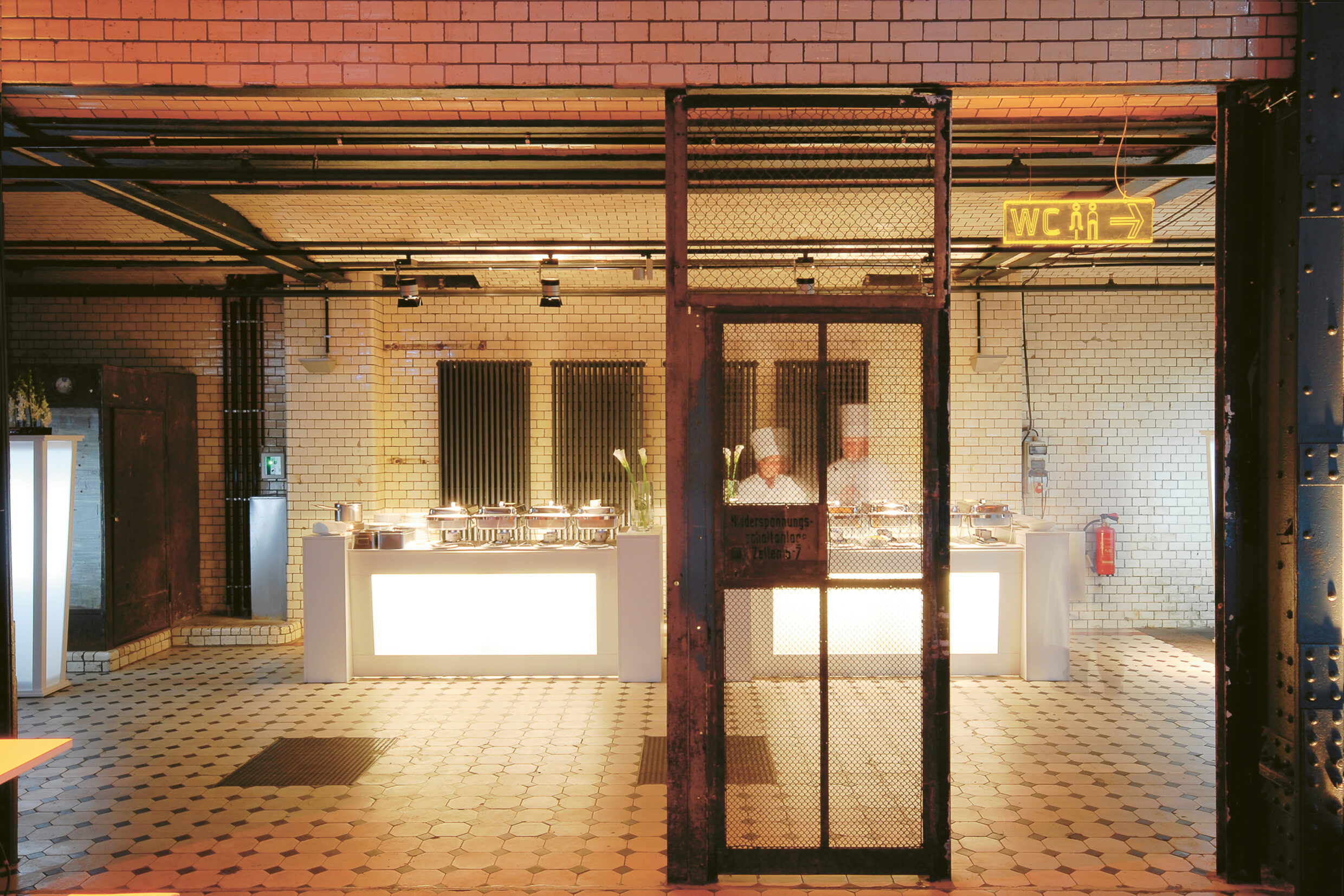
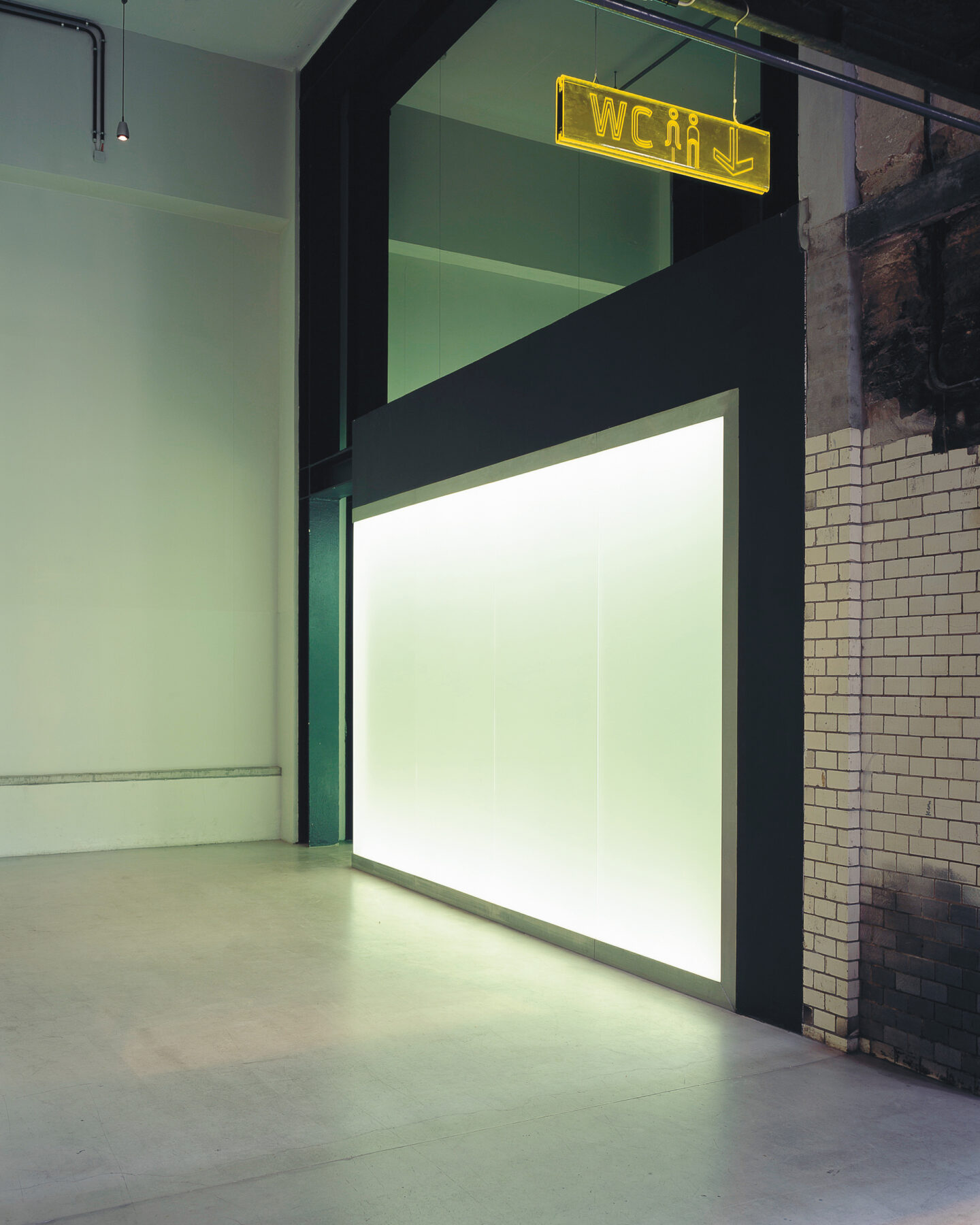
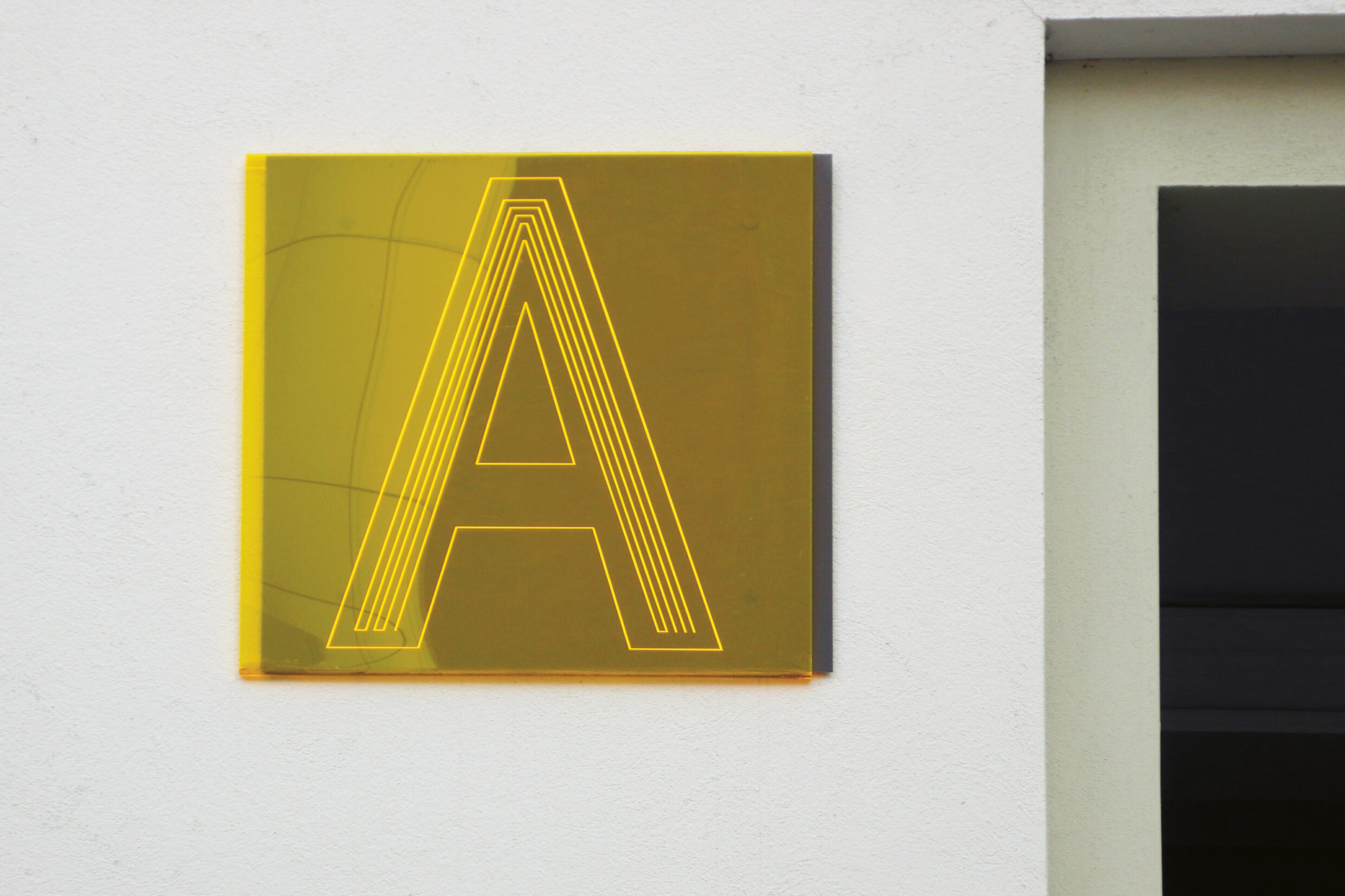
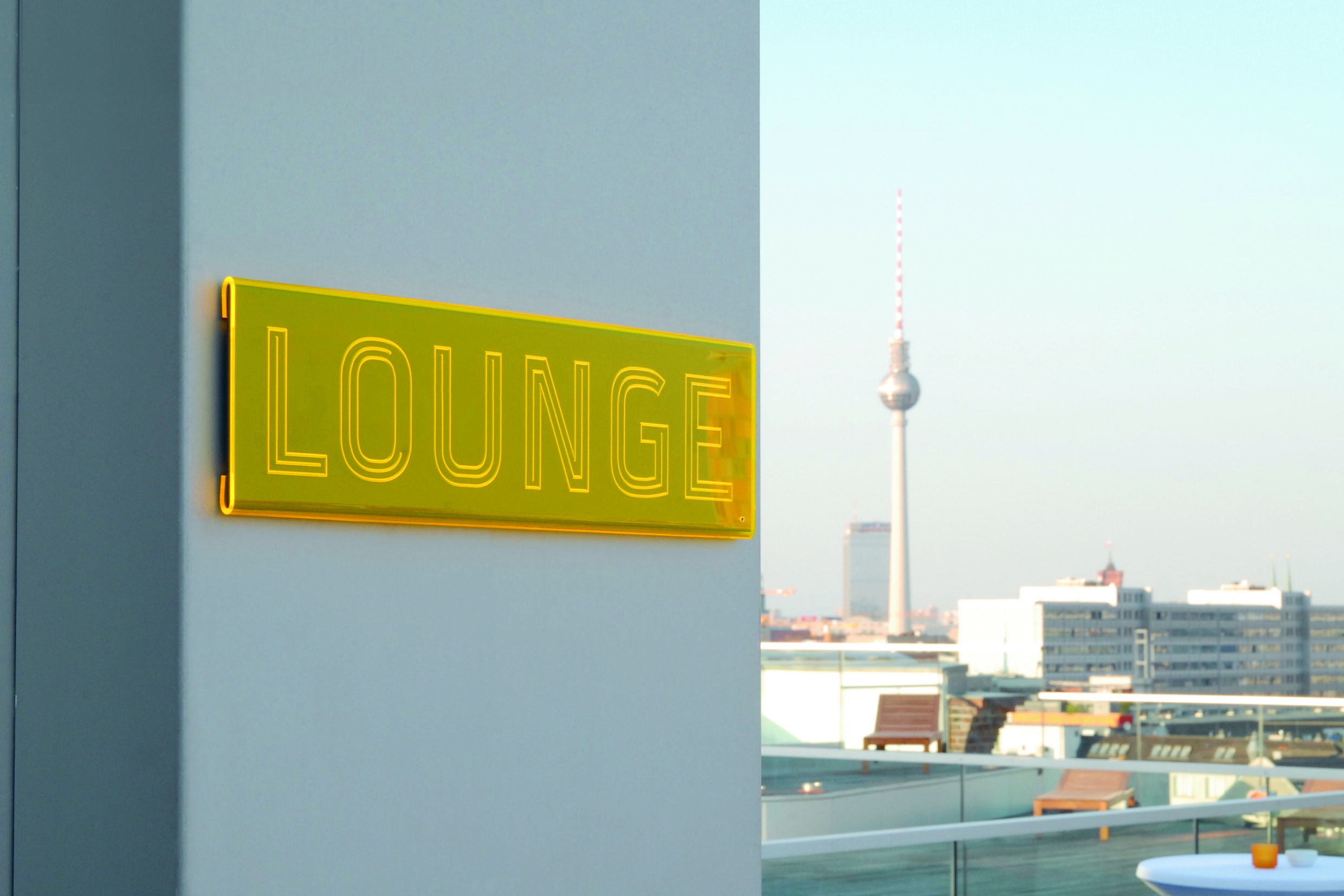
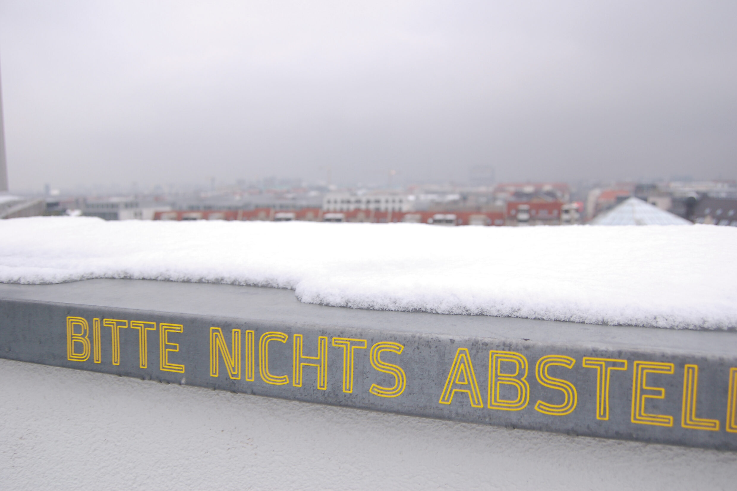
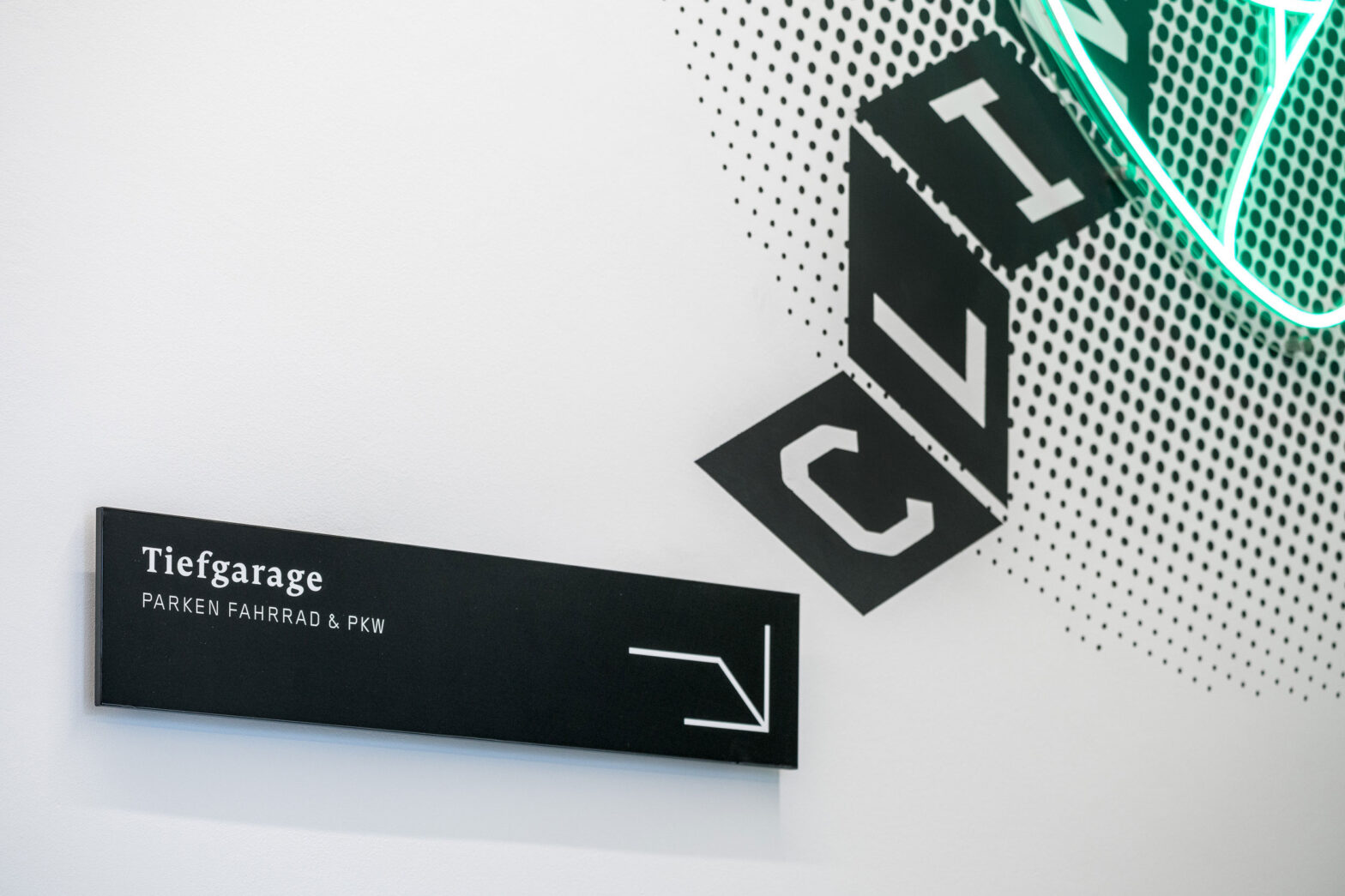
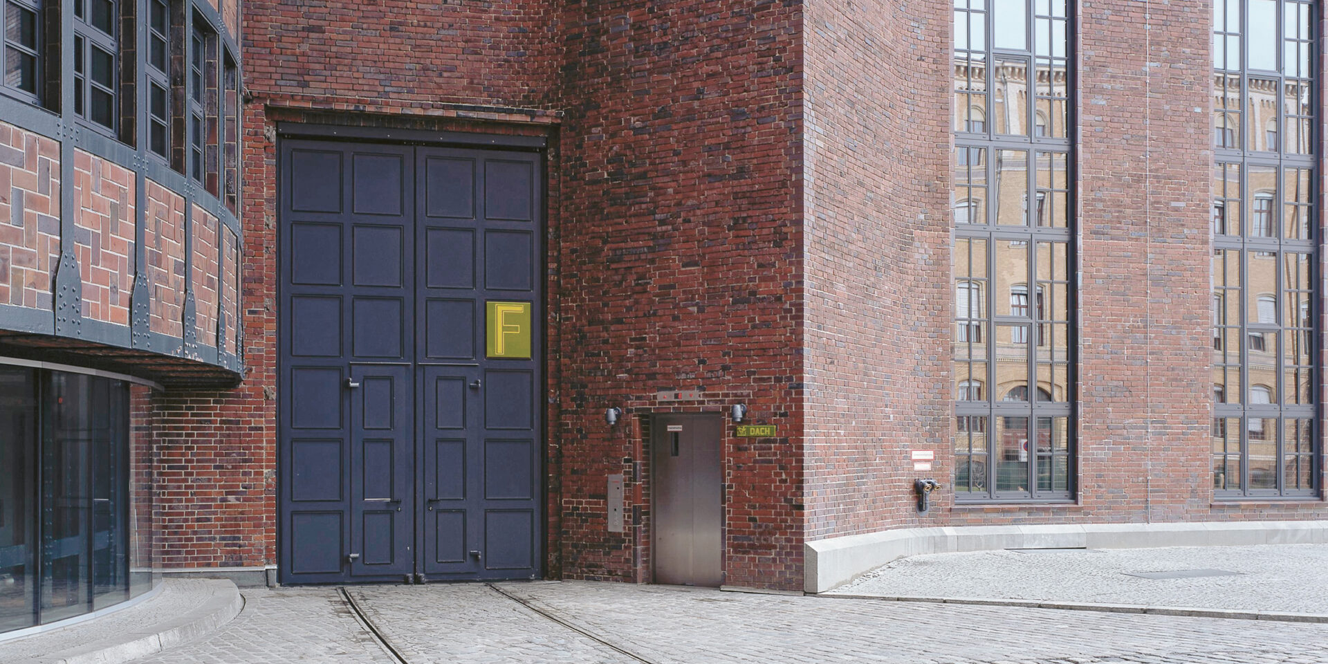
The old power station in the centre of Berlin is today one of the most famous event locations in the city, and also provides office space for large conferences. These different uses – by day and by night, for serious meetings as well as for glamorous parties – is reflected in the design of the orientation system. Based on the themes of “electricity”, “light” and “circuit boards”, Moniteurs developed a font reminiscent of the repetitive contours typical of neon signs. Engraved on yellow acrylic plates, the lettering enhances the self-lighting aspects of the material. At the same time, the design is so minimalist that it also works in the conference rooms of the ewerk – and underlines the special atmosphere of the industrial architecture.
Orientation System
Interior
Berlin 2010
Client
SPSPM Real Estate GmbH
Architecture
Hans Heinrich Müller (1928)
HSH Hoyer Schindele Hirschmüller
(Refurbishment and conversion of an industrial monument)
Area
13.000 m²
