Aufbau Haus
Orientation System
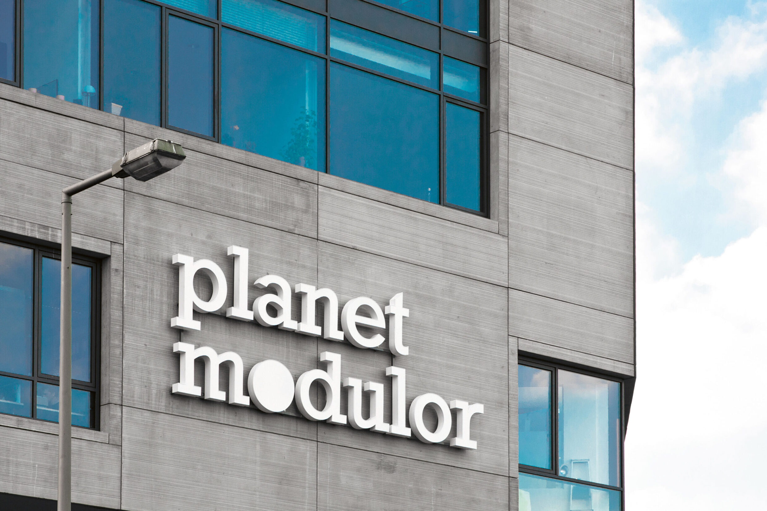
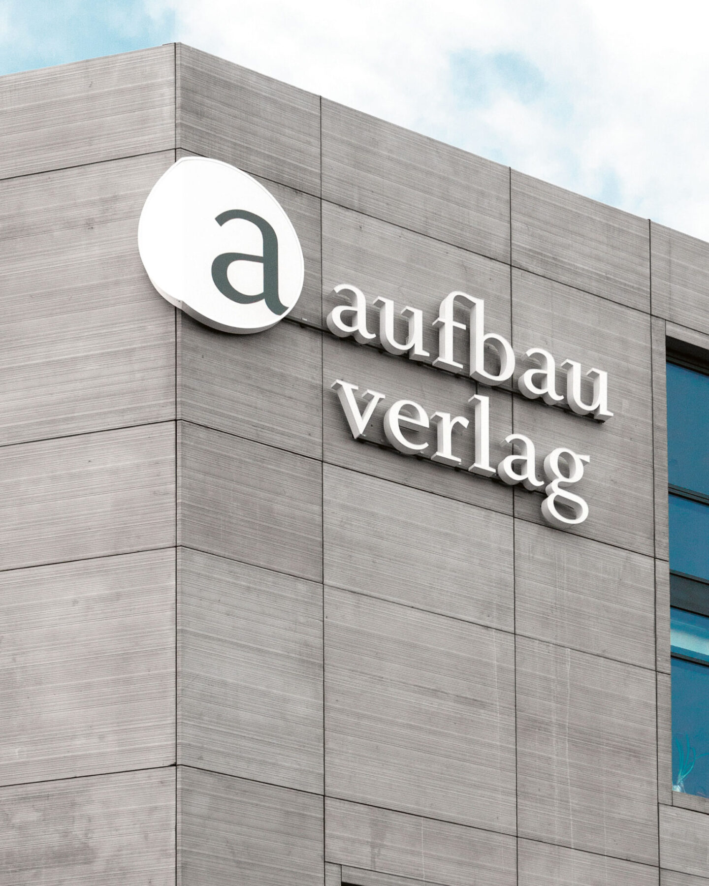
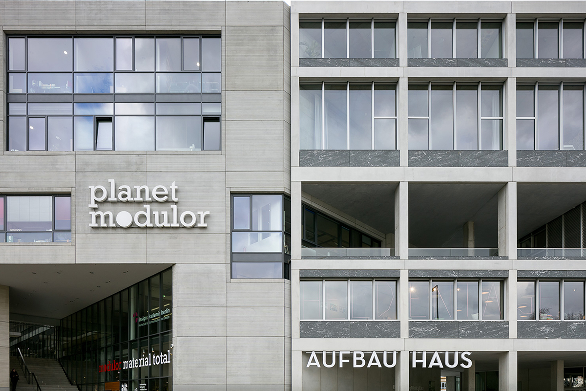
Two large companies have their headquarters at Aufbau Haus: the Aufbau Verlag Publishing House and Modulor, a material’s provider which, as Planet Modulor, provides additional services to the creative and craft industries in the building. The areas of activity of the two main tenants – writing and materials – provided the starting points for the design of the orientation system. Moniteurs’ idea was that the artisans of Planet Modulor should be involved in the creation process.
Orientation System
Facade and Interior
Berlin 2011
Client
Moritzplatz 1 Entwicklungsgesellschaft mbH
Architecture
Clarke und Kuhn freie Architekten BDA
Area
17,500 m²
Awards
European Design Awards 2012
red dot award 2012: communication design
Bundesdesignpreis 2012, nominated
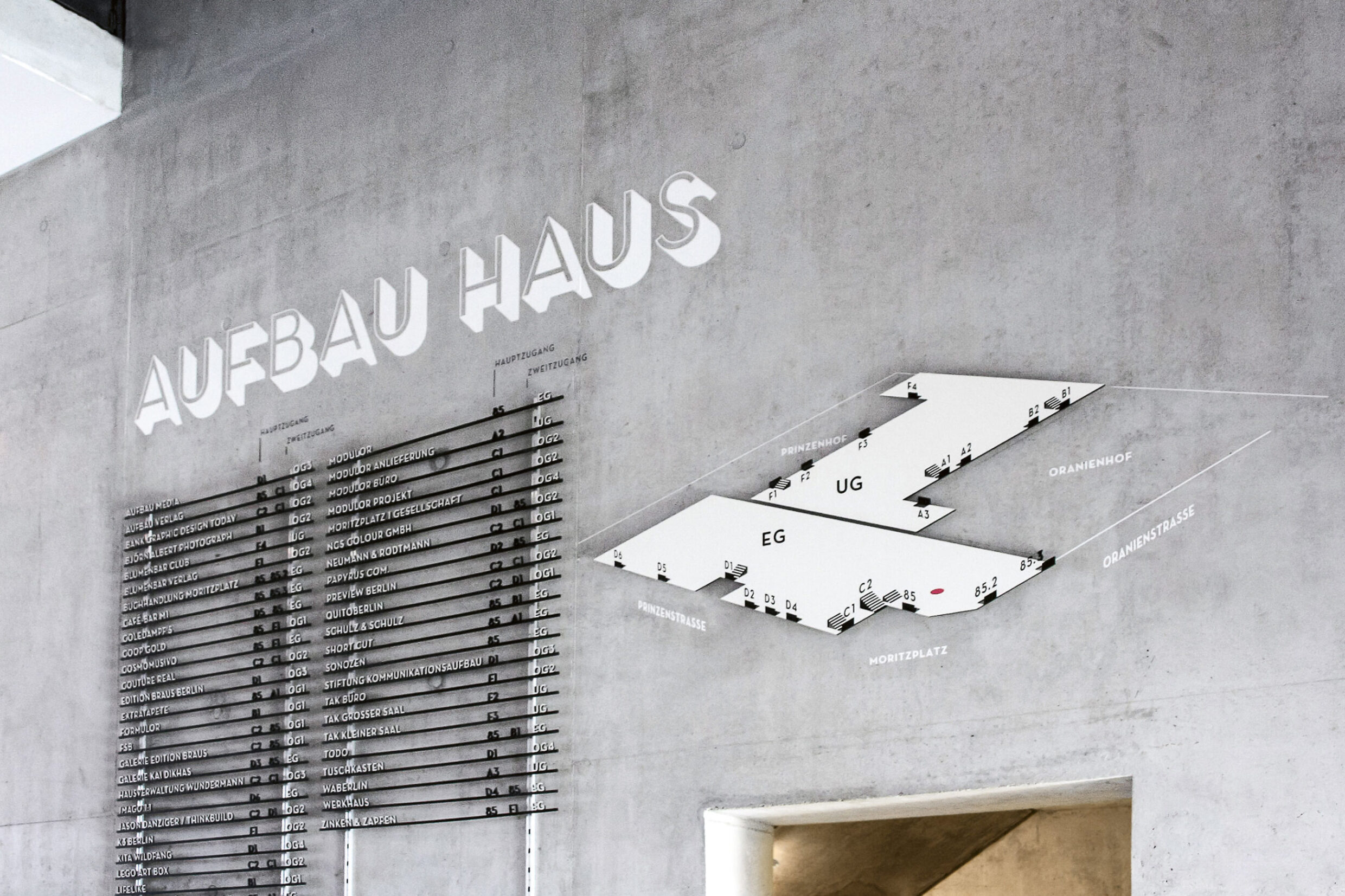
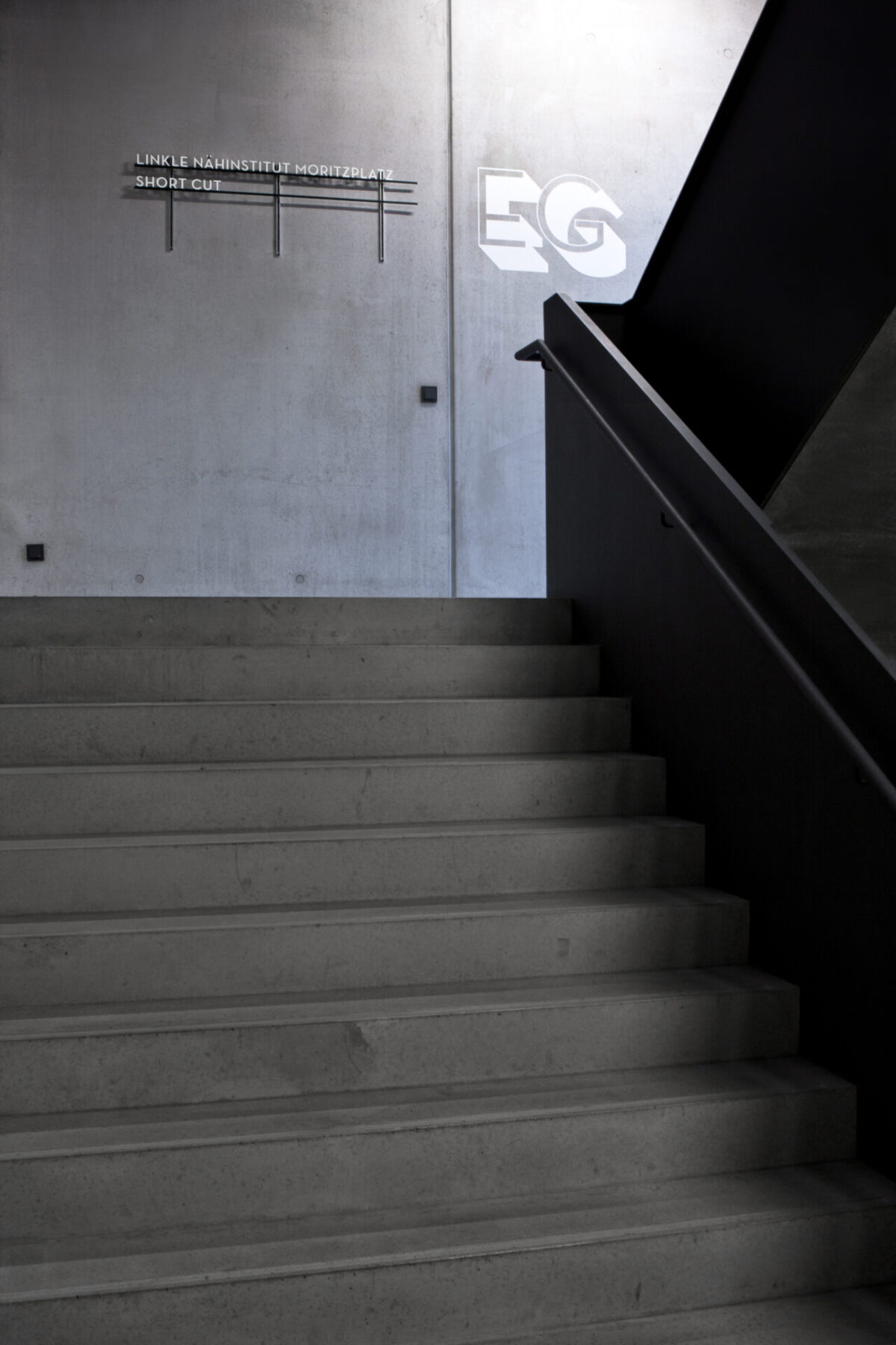
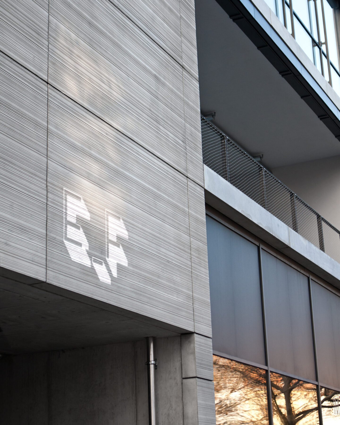
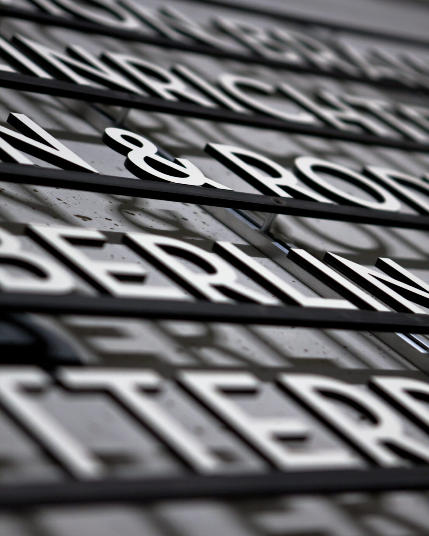
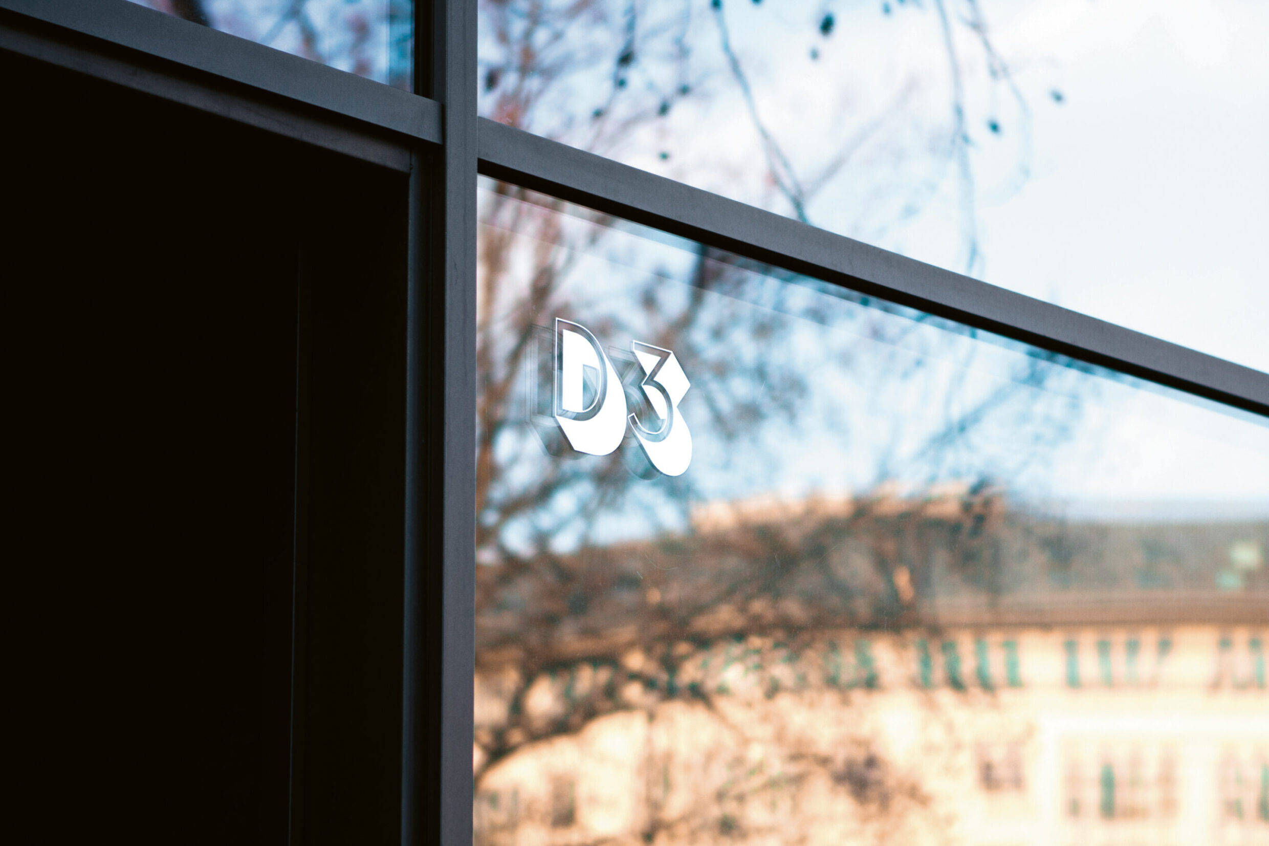
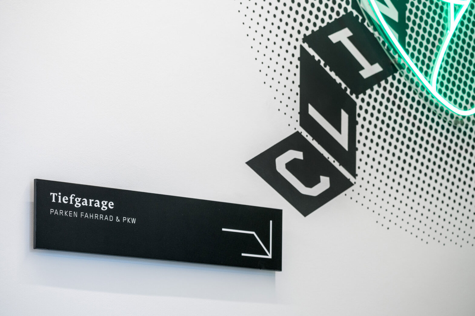
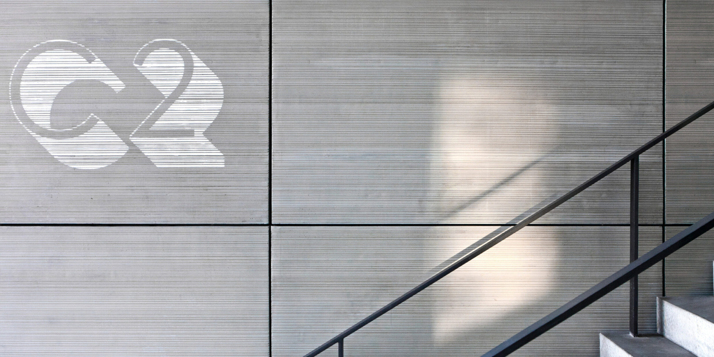
The concept of “materialised writing” presents itself in the form of milled lines on laminated plates. The individual lines are easily replaceable and can be exchanged whenever the tenants change. They can be combined with graceful three-dimensional signs on the wall. Thus, despite the variety of tenants, the design carries an overriding appearance that gives the building its own identity.
