Kulturpalast Dresden

Ori­en­ta­tion Sys­tem

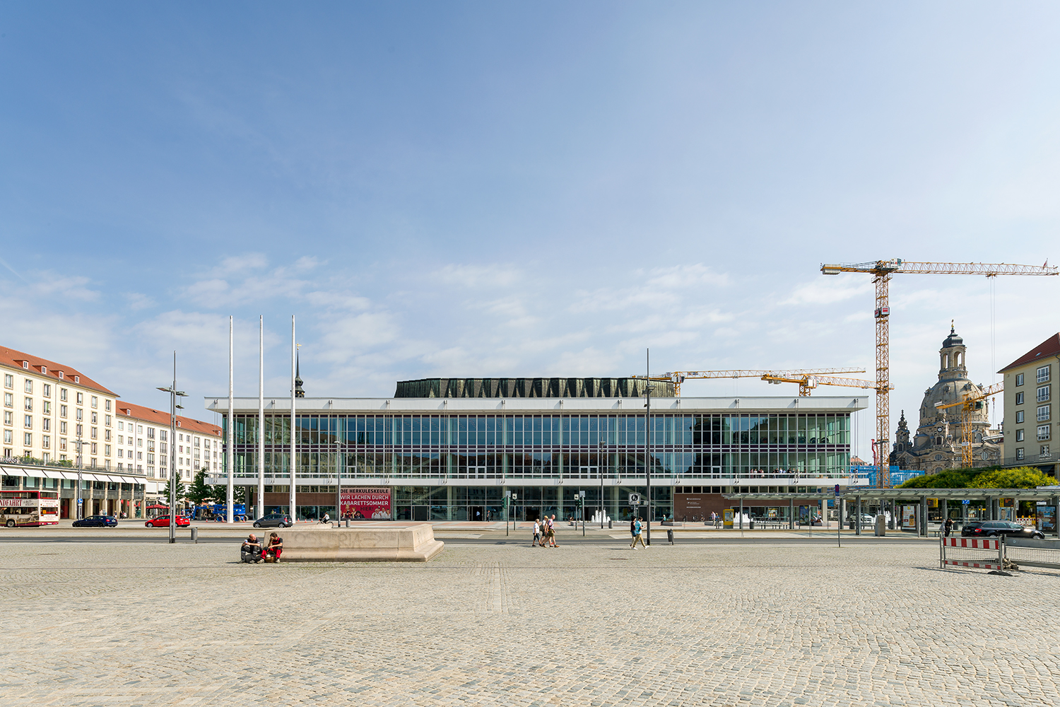
At the cen­tre of Dres­den, a place of en­counter and ex­change is go­ing to be re-opened – the Kul­tur­palast. The listed build­ing, re­stored and re­designed by gmp Ar­chi­tects, unites mu­sic, knowl­edge and the­atre un­der one roof. In the fu­ture, a di­verse range of peo­ple will move through­out the Kul­tur­palast. They all have dif­fer­ent needs and will be look­ing for dif­fer­ent spaces within the build­ing. As the flows of move­ment of each vis­i­tor group – vis­i­tors to the li­brary, the phil­har­monic and the cabaret – con­verge, in­ter­sect and sep­a­rate, it is para­mount to pro­vide op­ti­mal wayfind­ing in­for­ma­tion at every point in their jour­ney.

Kul­tur­palast Dres­den
Ori­en­ta­tion Sys­tem
In­door Area

Dres­den 2016/​17

Client

Kom­mu­nale Im­mo­bilien Dres­den GmbH & Co. KG

Ar­chi­tec­ture

von Gerkan, Marg and Part­ners Ar­chi­tects

Area
37,000 qm

Pho­tos

Ste­fan Schilling
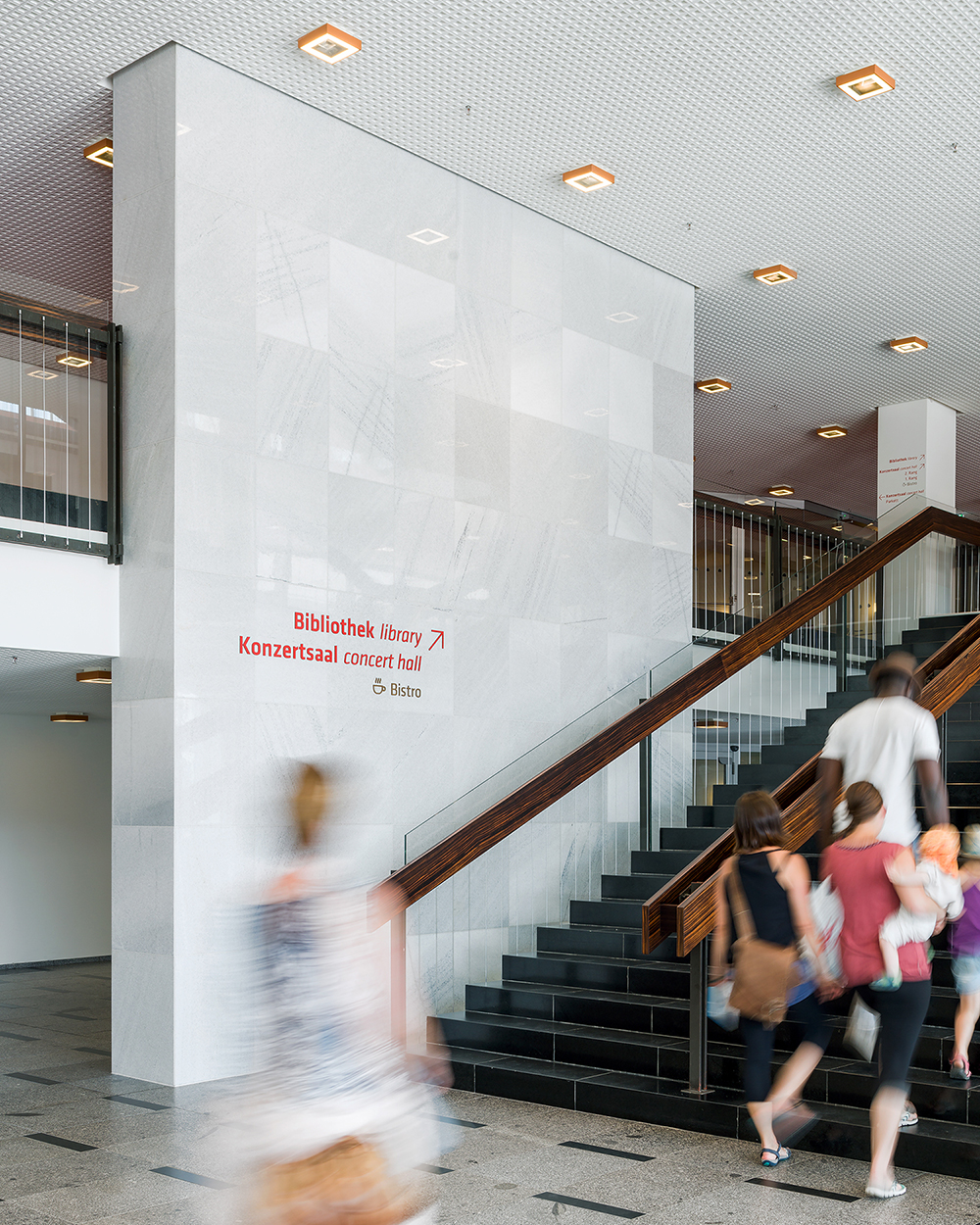
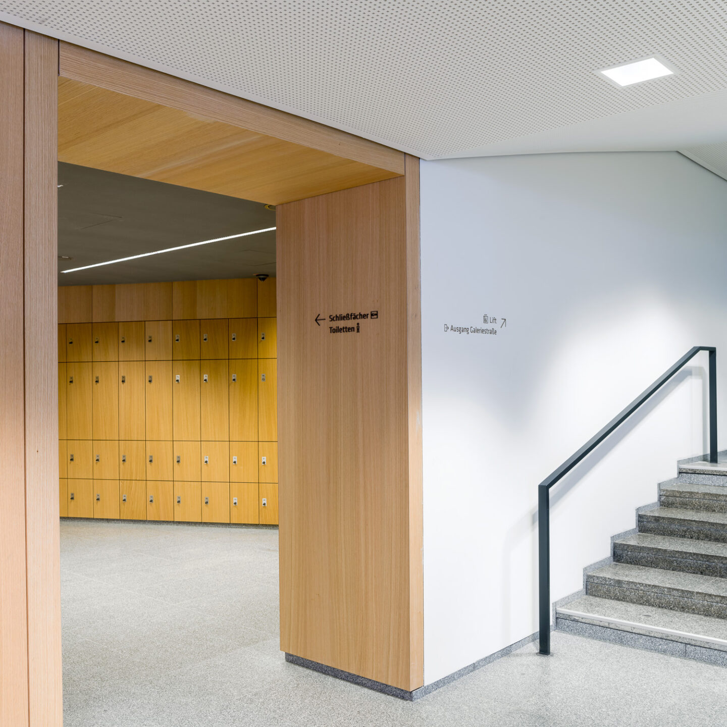
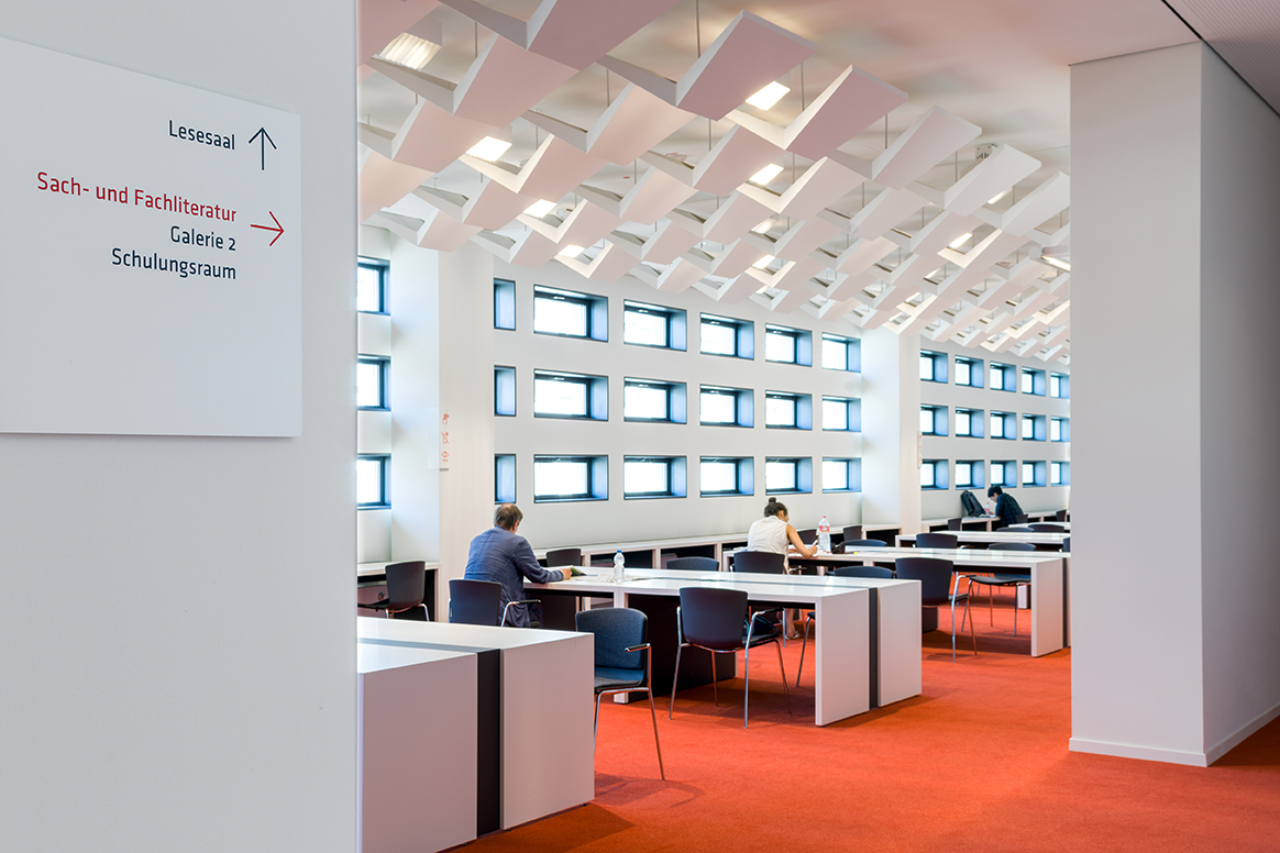
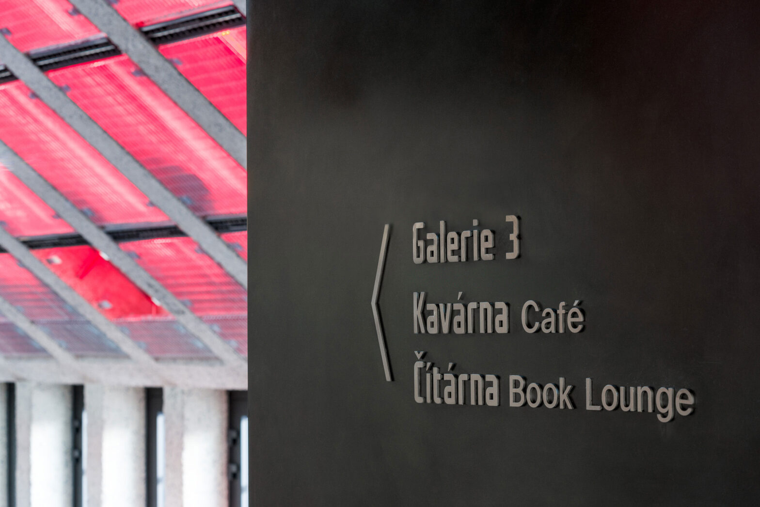
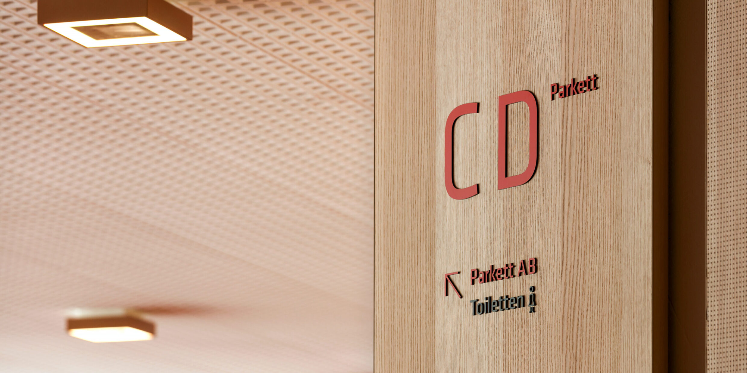
The points of in­ter­est (POI) are treated slightly dif­fer­ently in re­gard to con­tent and graph­ics: the pri­mary POIs are shown in two lan­guages and in large red let­ters, while the sec­ondary POIs are shown at a slightly smaller scale and in a dif­fer­ent colour. Sec­ondary POIs also come with a quickly as­cer­tain­able pic­togram to en­sure that they are un­der­stood in­ter­na­tion­ally.
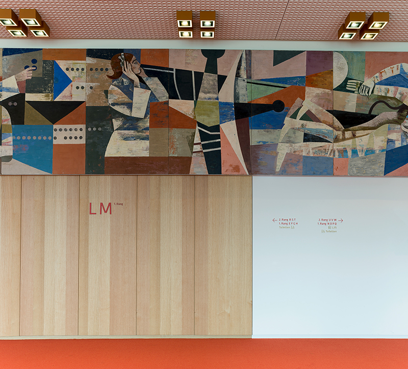
The wayfind­ing sys­tem’s ma­te­r­ial and colours are de­rived from the build­ing’s promi­nent in­te­rior de­sign. Warm colours such as cop­per and red are re­flected in the let­ter­ing.
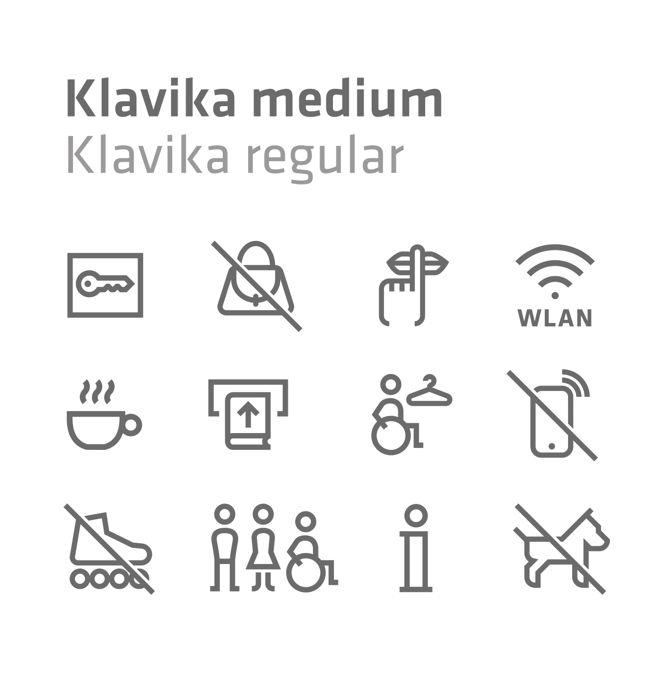
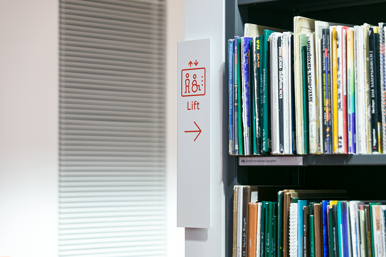
Based on the cor­po­rate iden­tity font, Moni­teurs de­vel­oped a be­spoke pic­togram fam­ily.
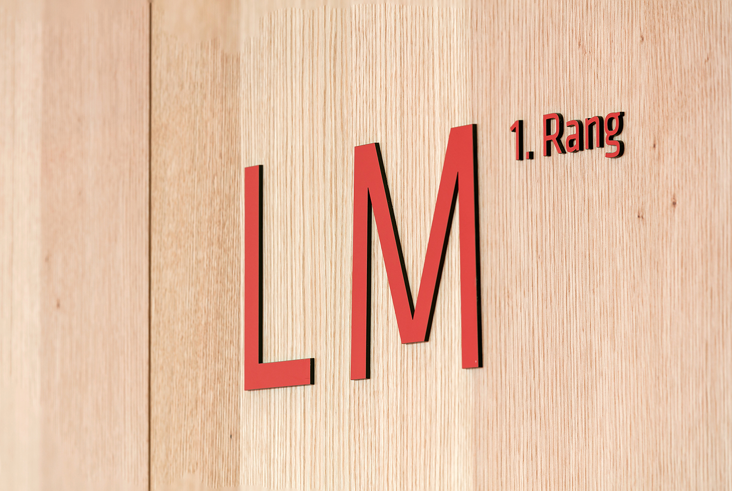
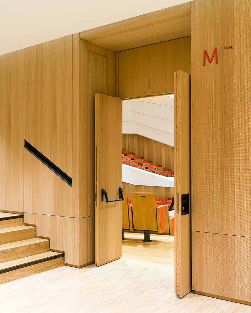
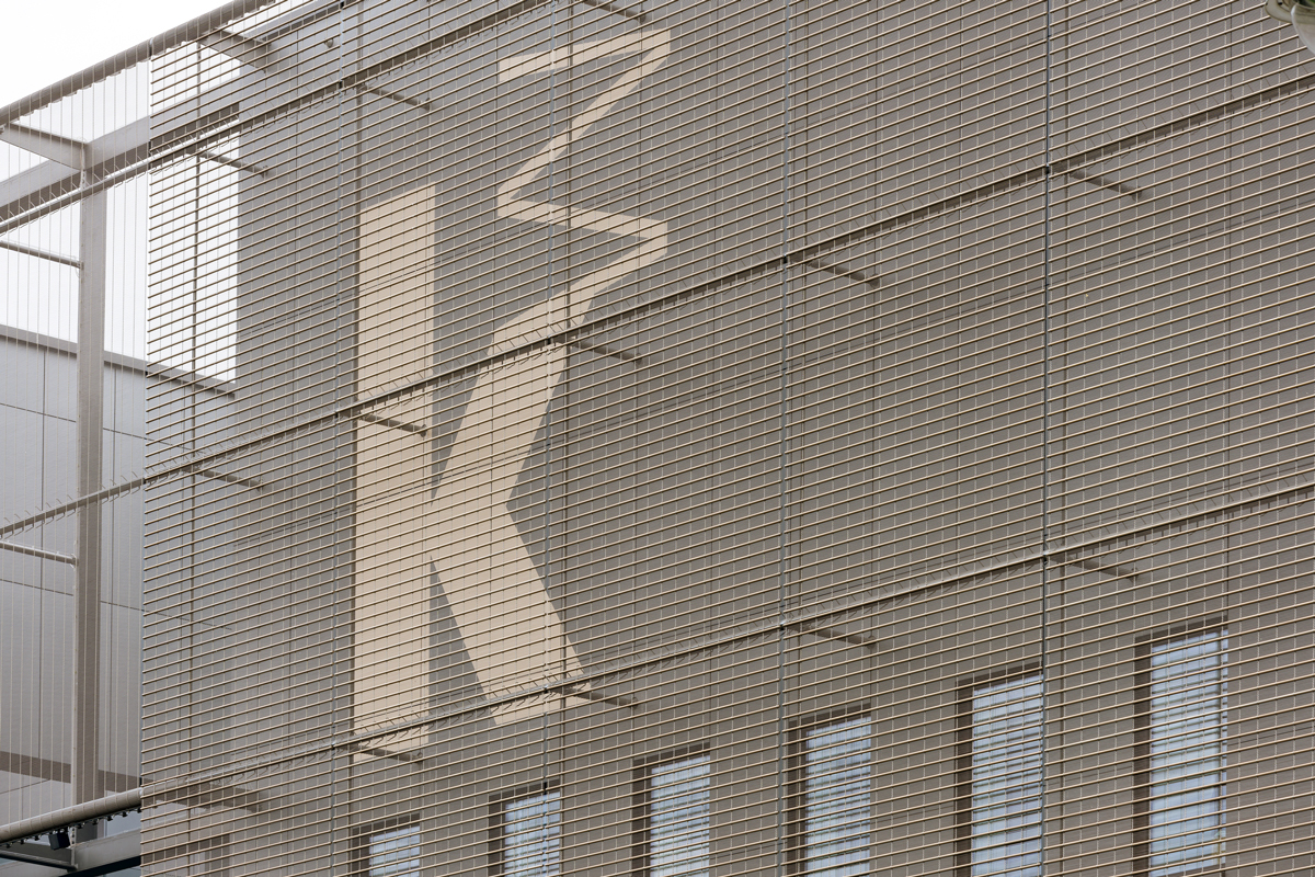
As it was done for the orig­i­nal Kul­tur­palast, the let­ter­ing has been ap­plied di­rectly to the walls as in­di­vid­ual let­ters. Since the build­ing has been de­signed to be very open and spa­cious, there are of­ten large read­ing dis­tances. Cor­re­spond­ingly large text sizes were cho­sen and are com­fort­able to read.
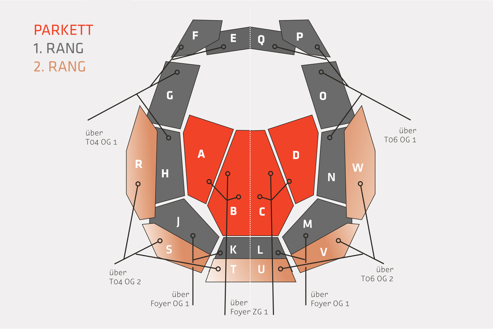
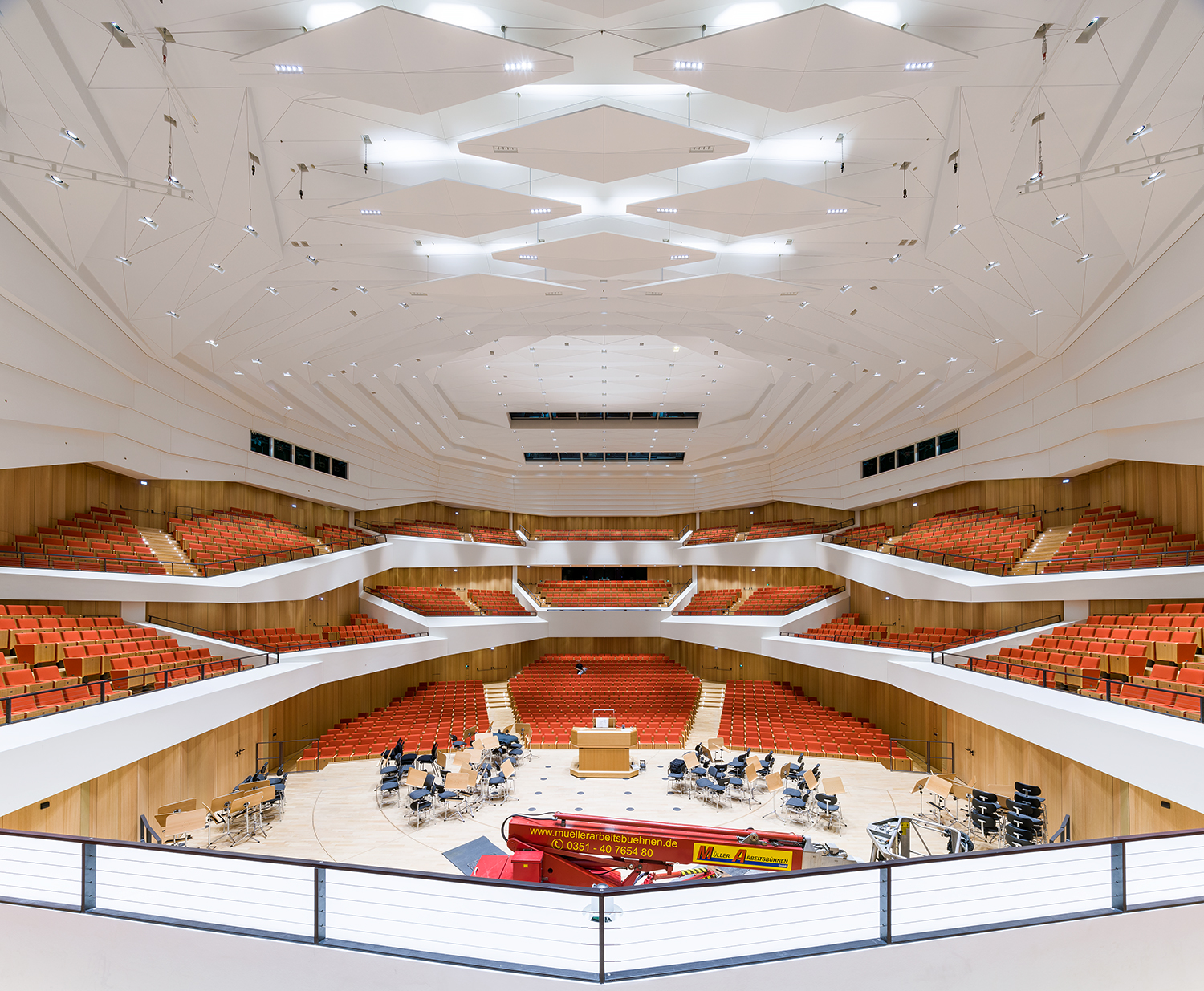
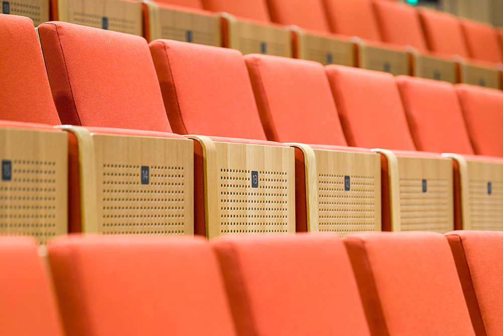
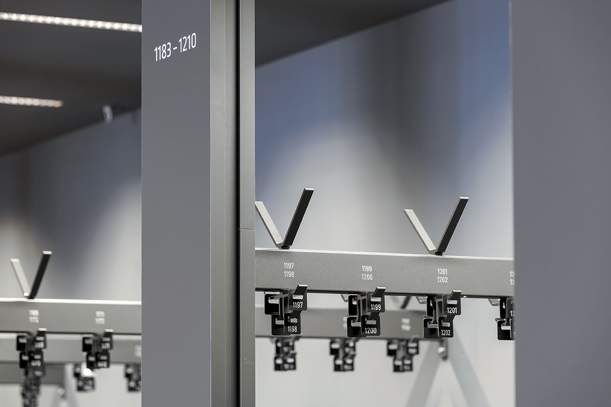
The nam­ing con­cept for the con­cert hal­l’s stalls and en­trances were de­vel­oped with the Dres­d­ner Phil­har­monie and over­seen by Moni­teurs, in­clud­ing the num­ber­ing of seat­ing rows and the seats them­selves. There were also clear guide­lines for the let­ter­ing of the cloak­rooms for the con­cert and cabaret vis­i­tors. (The cor­po­rate type­face of the Kul­tur­palast is used every­where.)
The sign hold­ers in the li­brary are de­rived from a sim­ple plan and, as cor­ner signs, en­close the promi­nent columns.
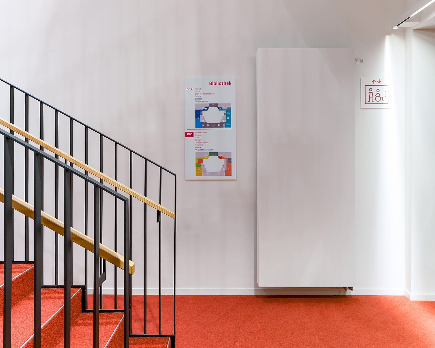
Li­brary overview plan: The lev­els are coded us­ing warm and cold colour ranges. The colour con­trasts are tested in re­gard to red-green de­fi­ciency.